Evolutio
A virtual physical therapy app, redesigned in a 4-week hybrid Design Thinking / Lean UX sprint. Conversion rate rose 37% after redesigning navigation and turning appointment booking into a guided, step-by-step flow.
The problem
A patient portal patients couldn't use
Evolutio's patient app lets existing customers schedule appointments, follow prescribed exercises, and message their physical therapists. In practice, none of that was working: analytics from a 4-week period showed zero appointment-scheduling events, a 48% drop in average engagement time, and a 34% drop in exercise session duration.
The root causes surfaced quickly:
- An unlabeled, cluttered nav bar — invoices and medical forms occupied prime tabs while appointments had no dedicated page at all.
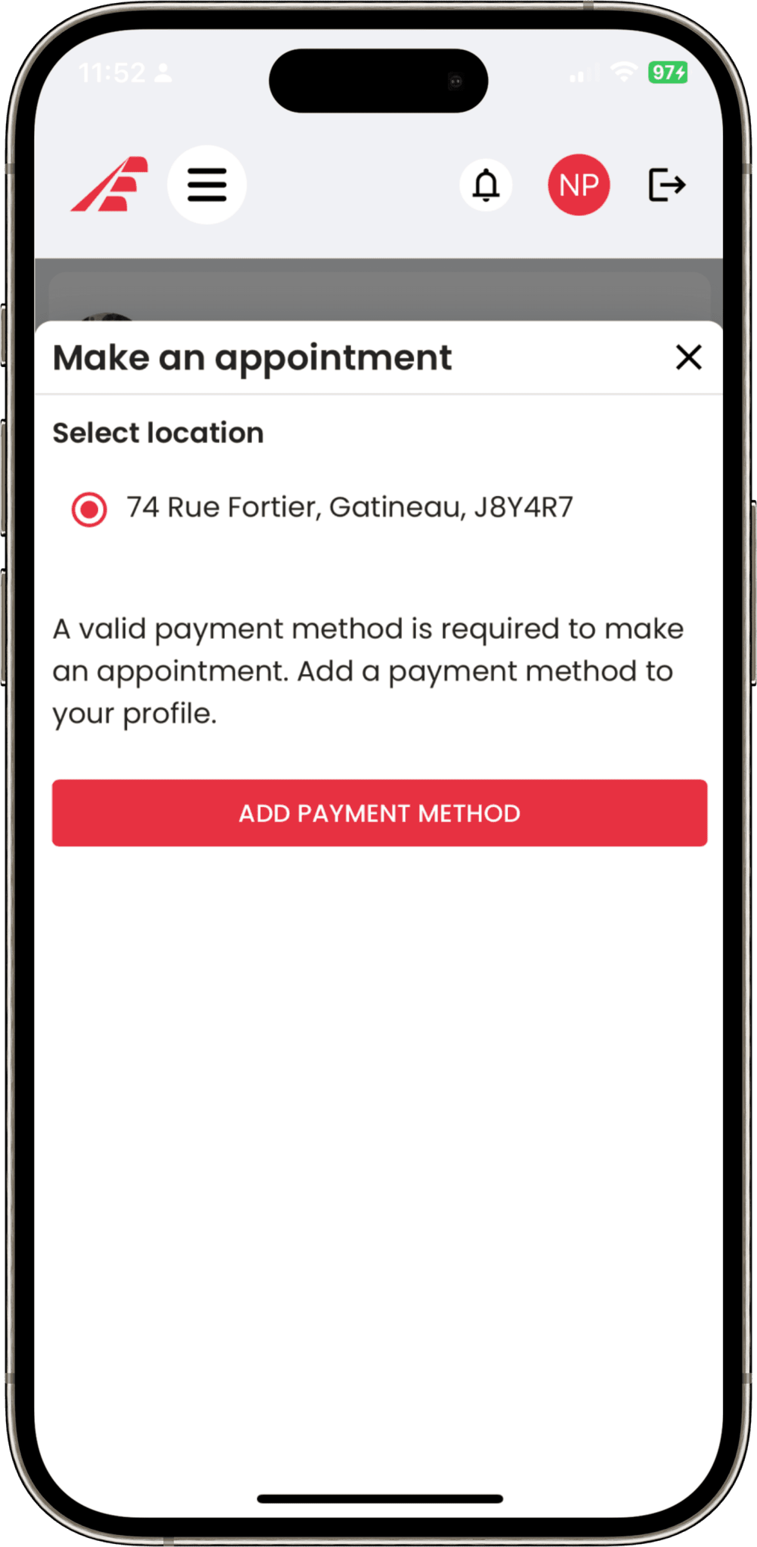
- Booking required entering a credit card before seeing any appointment details, driving users away.
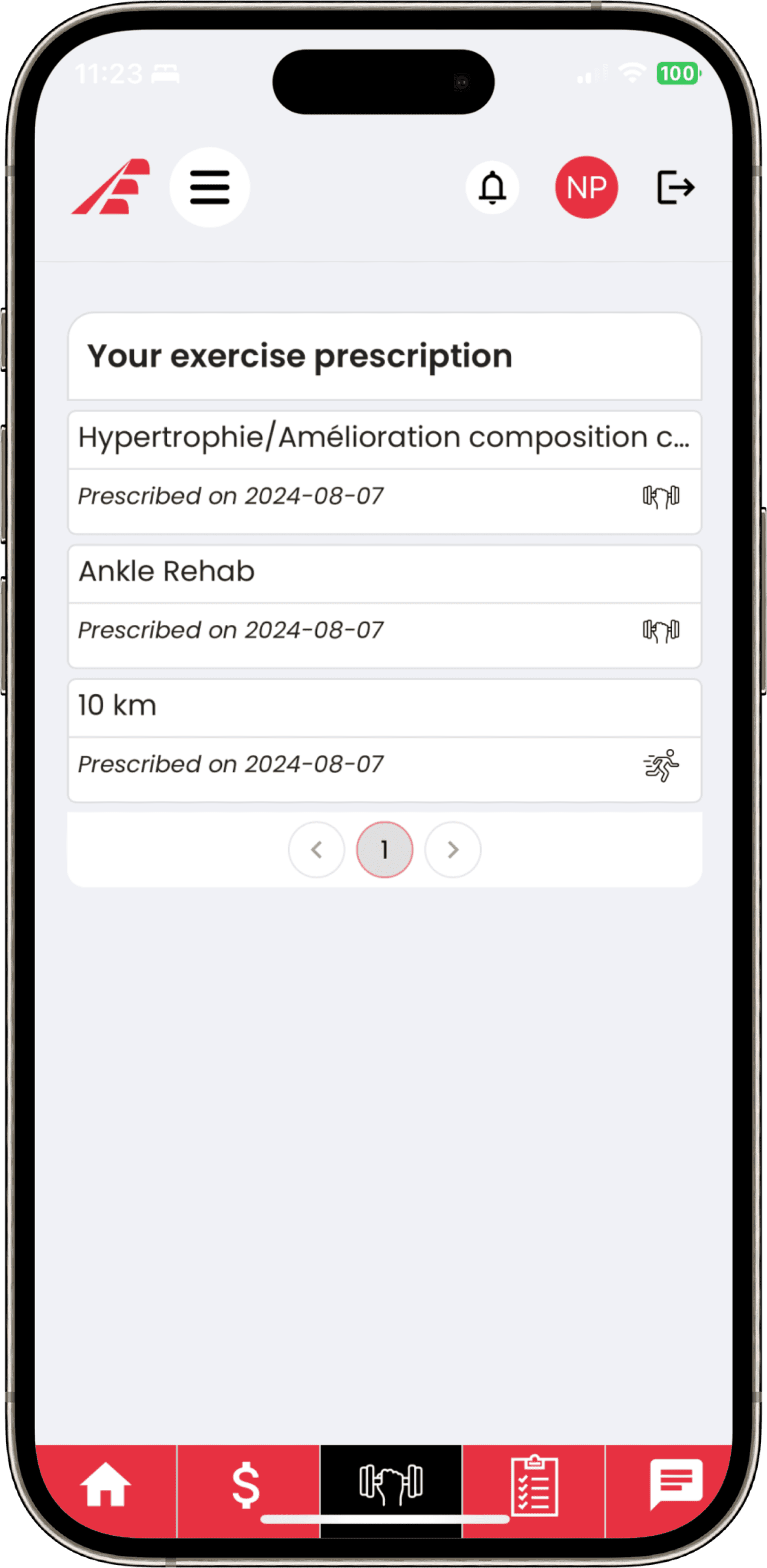
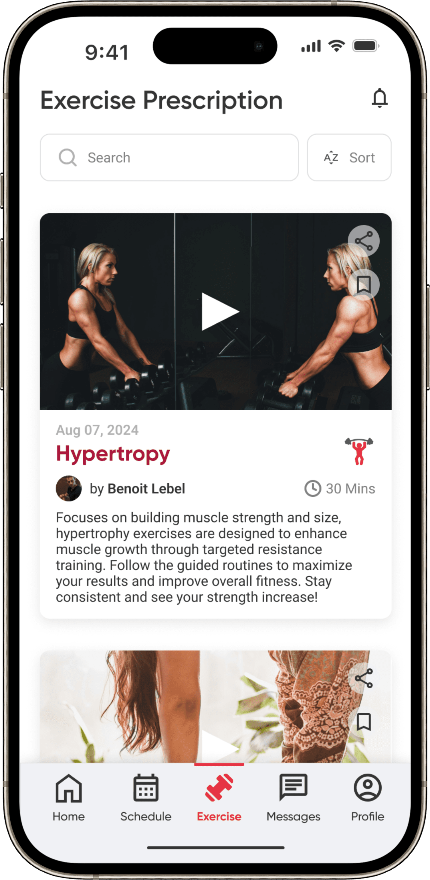
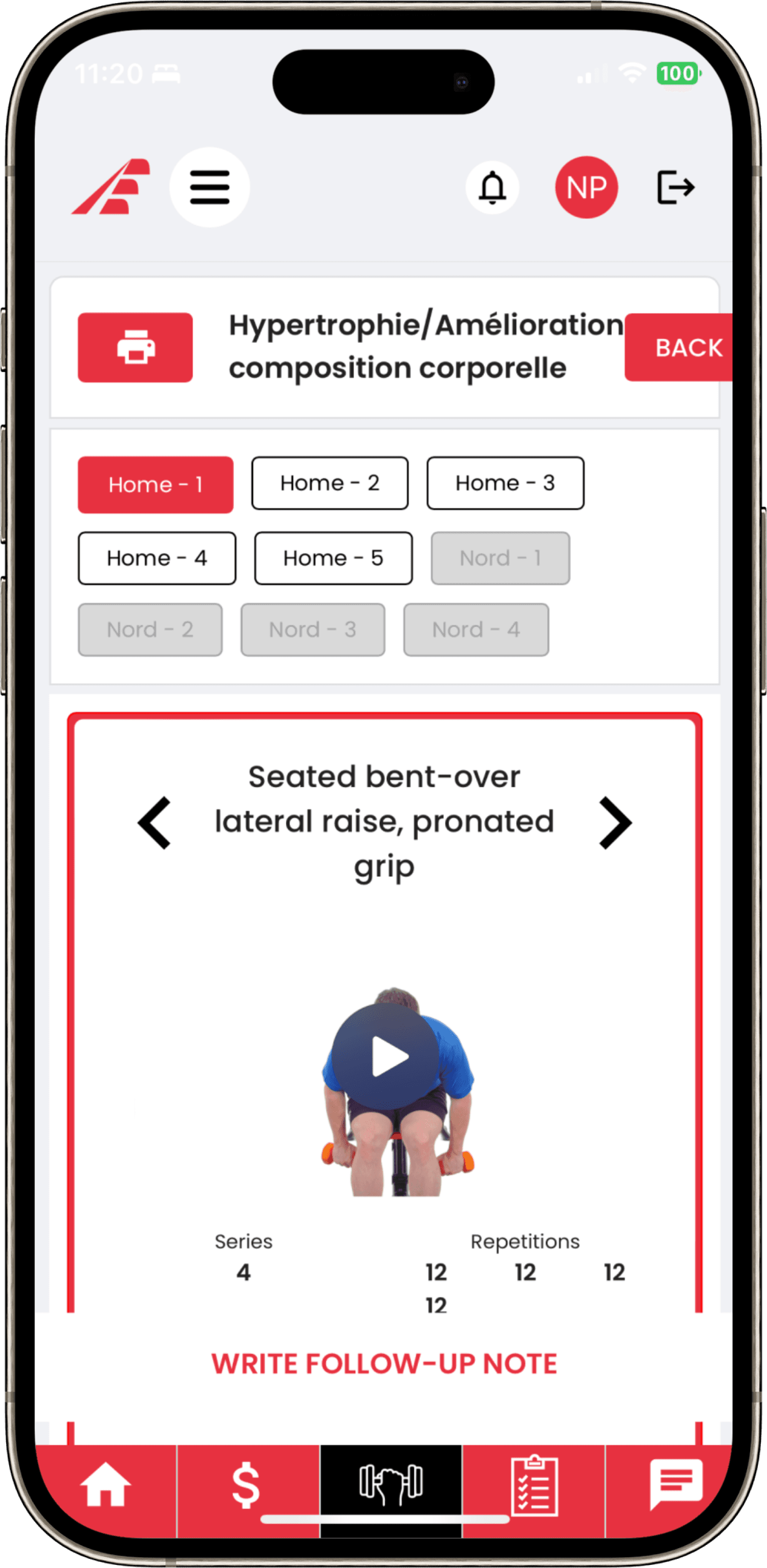
- Exercise instructions were plain technical text with no visual support, making programs hard to follow.
Research
Aligning business goals with user pain
In weekly stakeholder sessions, the owner's goals were clear: grow appointment bookings by at least 10%, improve exercise engagement, and bring the UI in line with the brand. Interviews with 5+ active users told the same story from the other side — 50% struggled with navigation and 38% disliked the booking process.
“I dislike the fact that I was asked to put in my credit card prior to seeing any other relevant information…”— Thao, 27 — user interview
A competitive scan of PhysiApp, Zocdoc, and Kaia Health showed each excels at either scheduling or exercise programs — never both. Doing both well became Evolutio's differentiator and shaped the MVP scope: with a 4-week timeline, we prioritized ruthlessly using HMW statements and a prioritization matrix.
The solution
A nav that makes sense, and a booking flow that guides
The redesign came down to three structural moves:
- Rebuilt the nav bar — labeled icons, and invoices/medical forms relocated under a new Profile page where users expect them.
- Added a dedicated Schedule page with a clear call-to-action, upcoming/past appointments, and a proper calendar.
- Replaced card-first booking with a 5-step guided flow (therapist → service → date & time → payment → review) tracked by a progress bar, ending in a clear confirmation.
I proposed and sketched the guided scheduling flow, presenting it to stakeholders as a wireflow. Therapist information — cut from scope as a standalone page for budget reasons — was folded into the booking steps instead, so users could still make informed choices.


Highlights
Before & After
Home
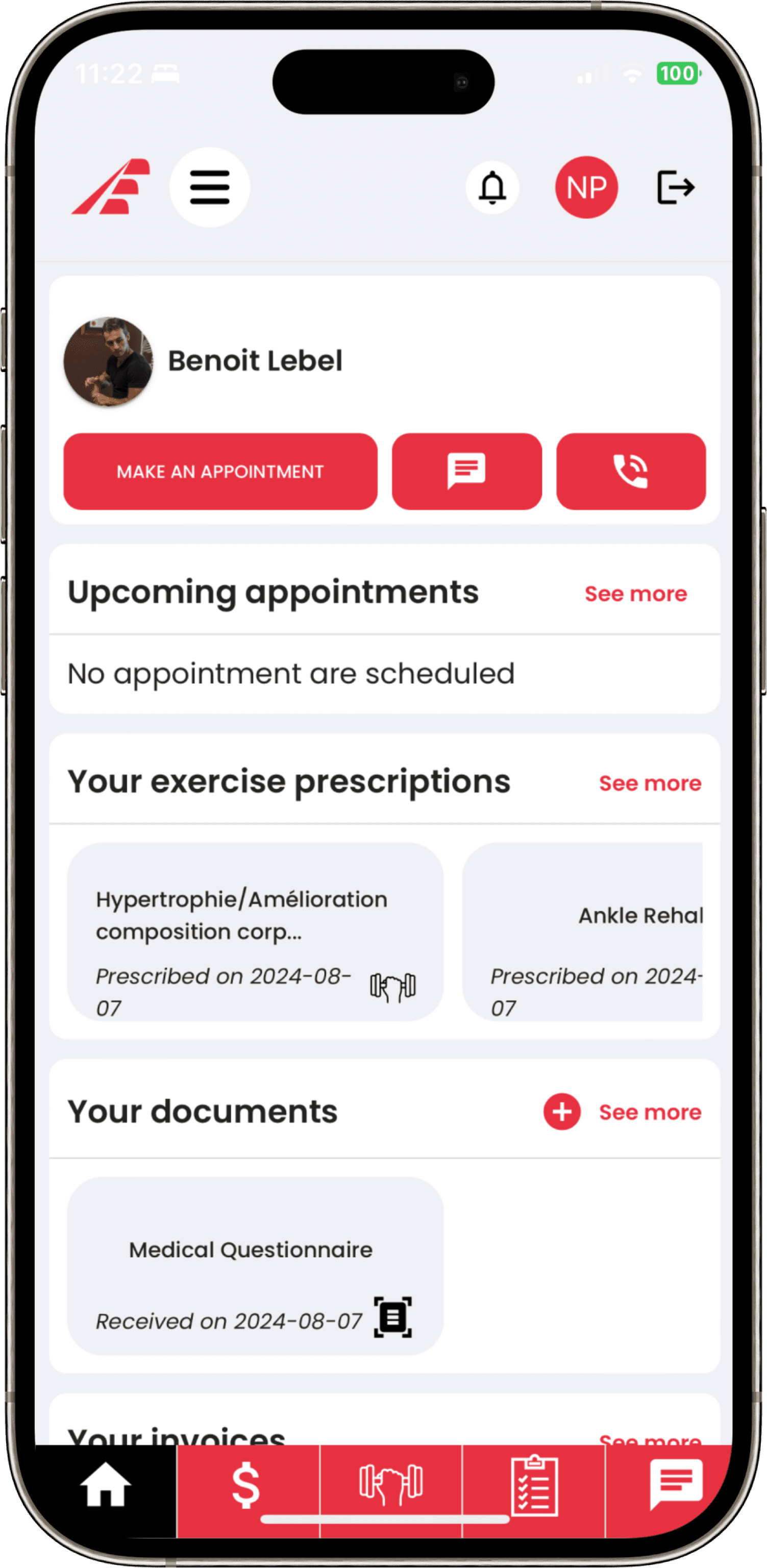 Before
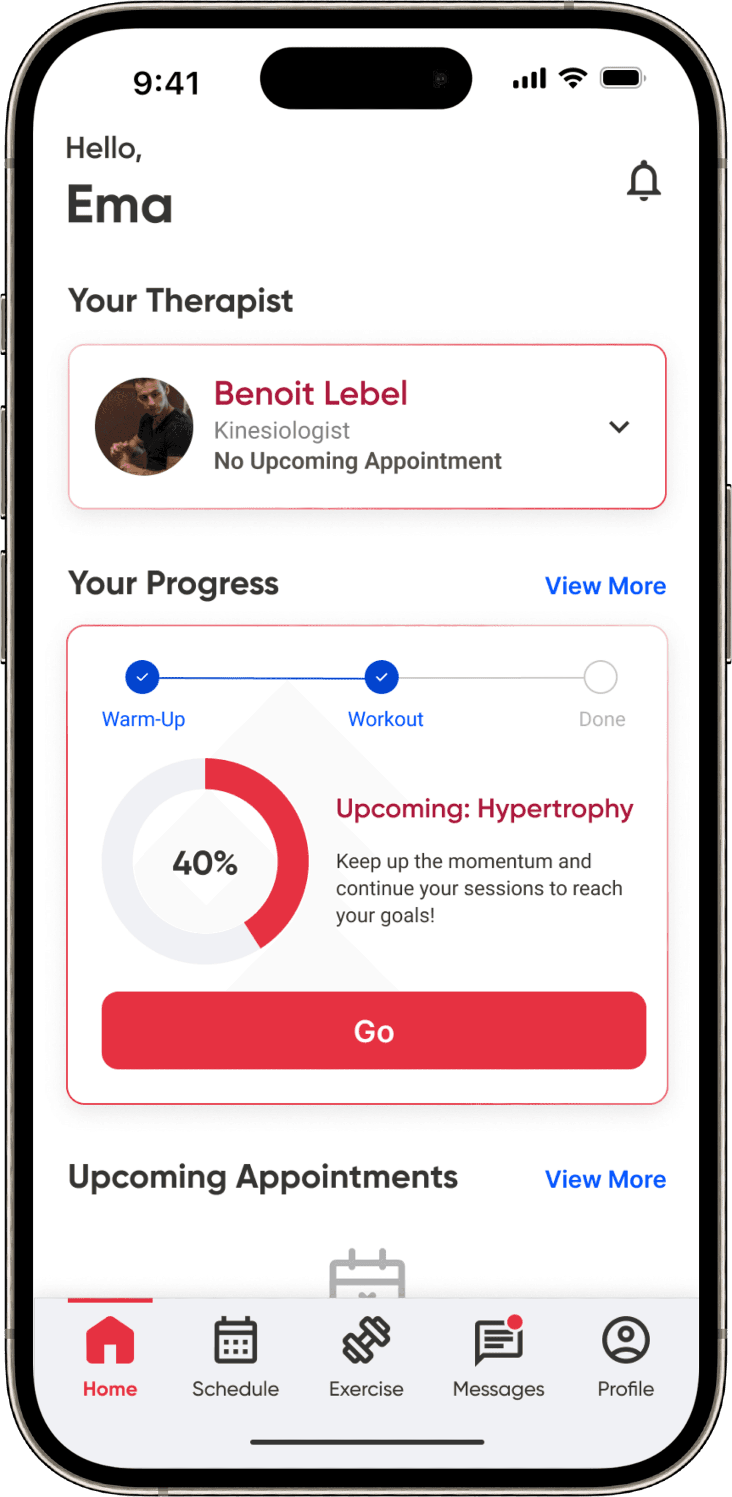 After
AfterSchedule · Upcoming appointments
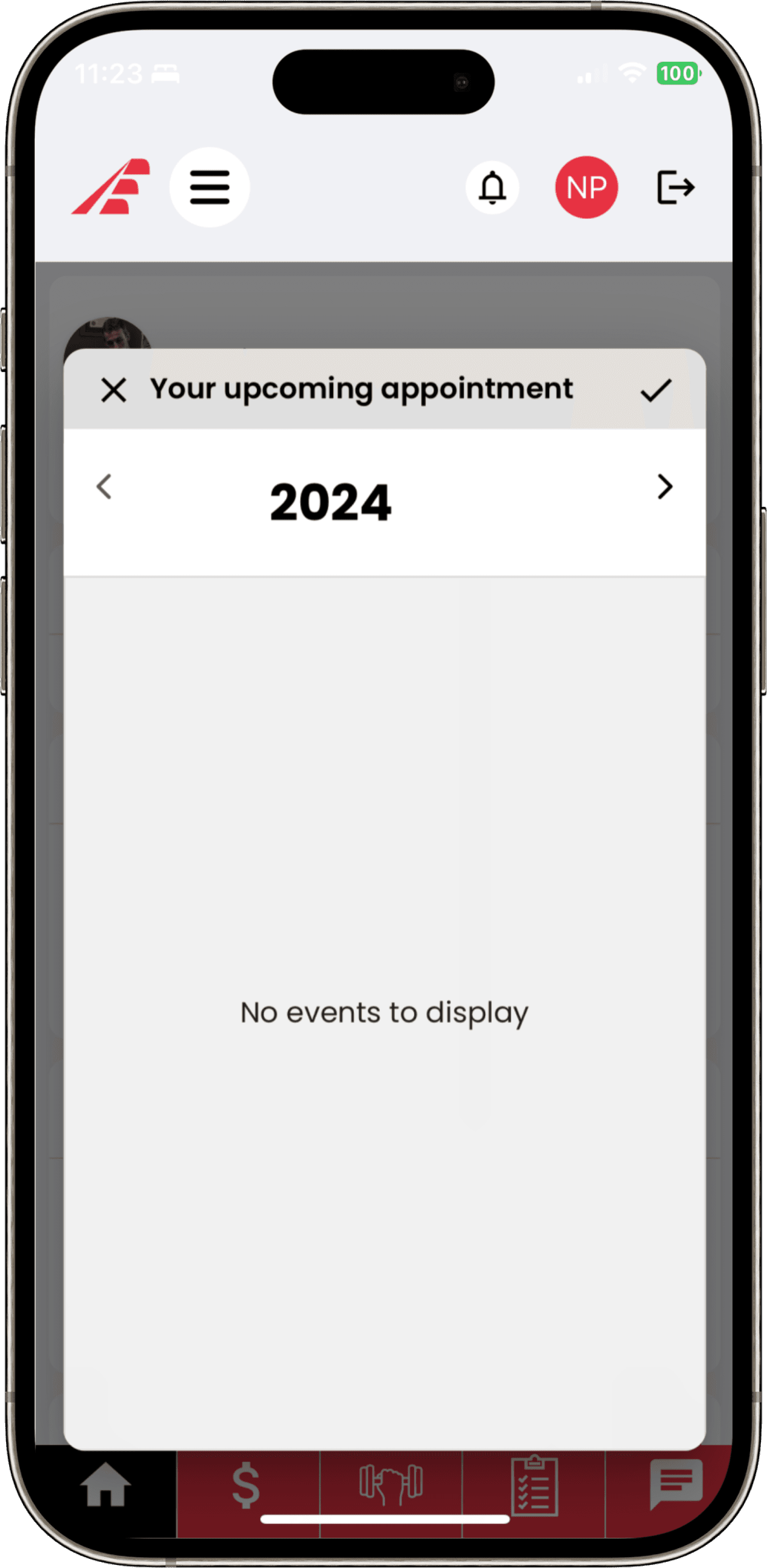 Before
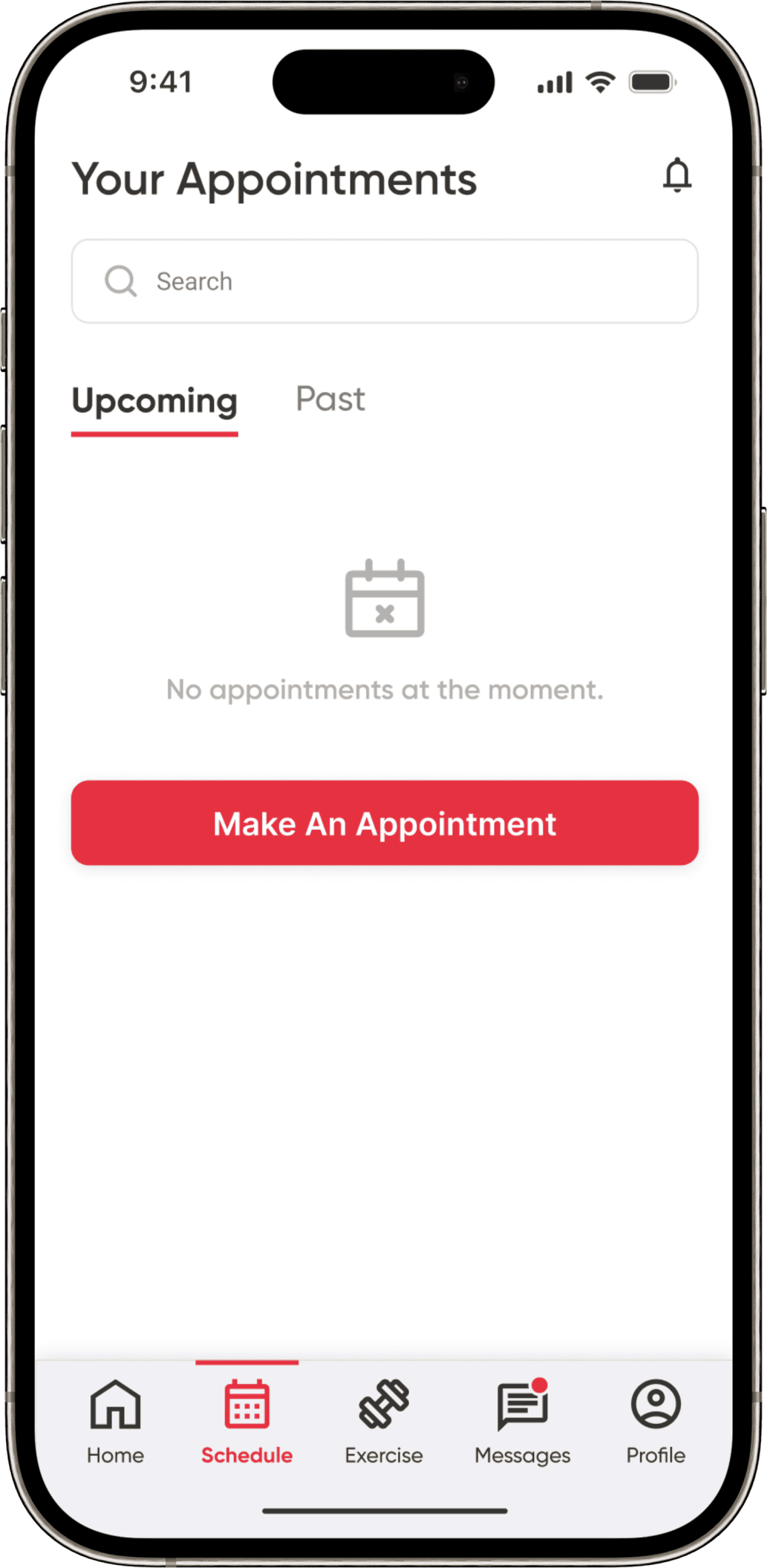 After
AfterSchedule · Make an appointment
 Before
 After
AfterExercise · Prescriptions
 Before
 After
AfterExercise · Program
 Before
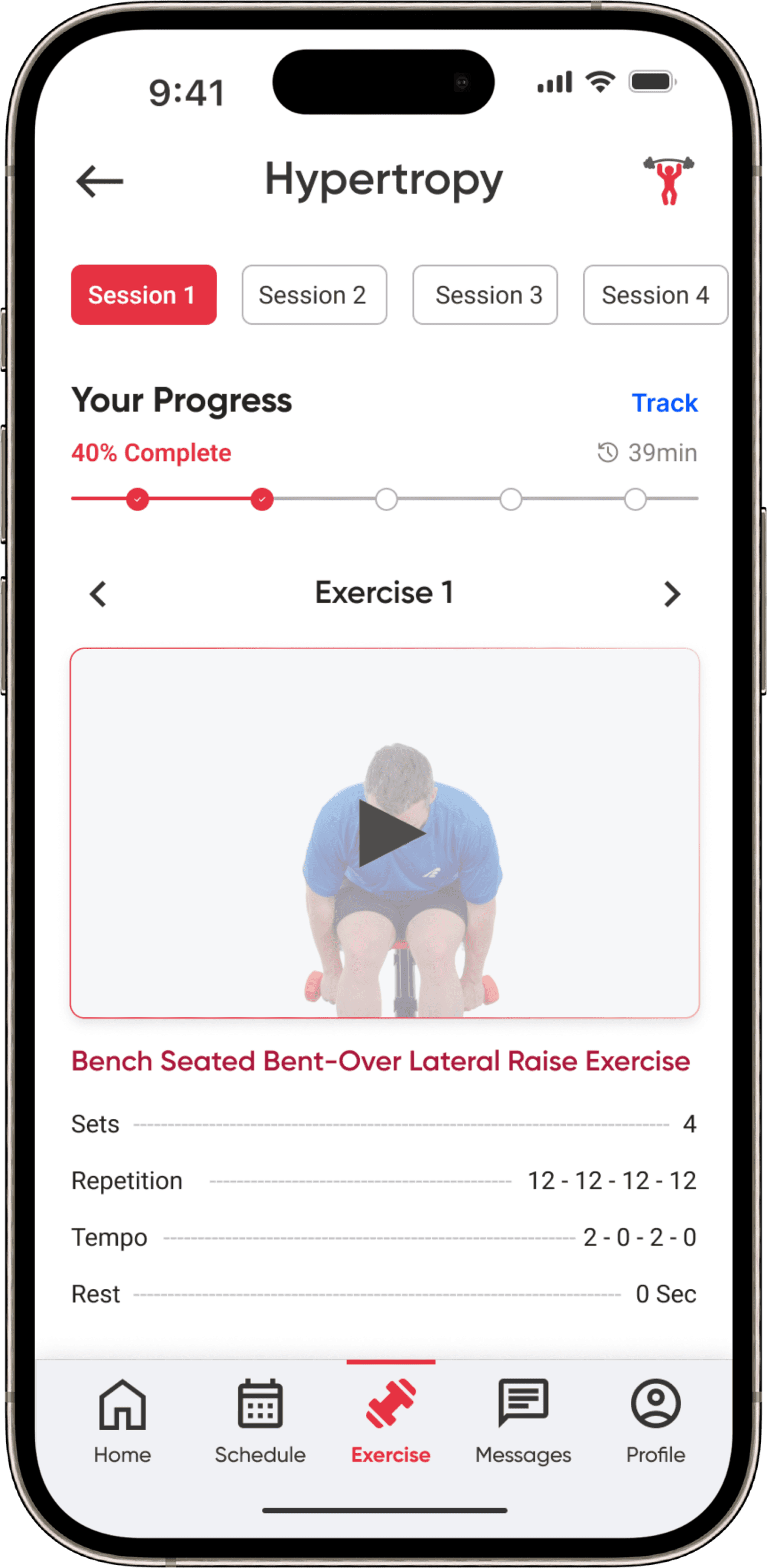 After
AfterMessages
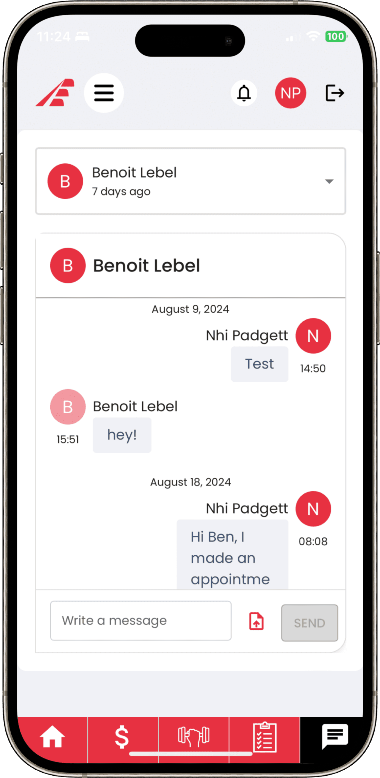 Before
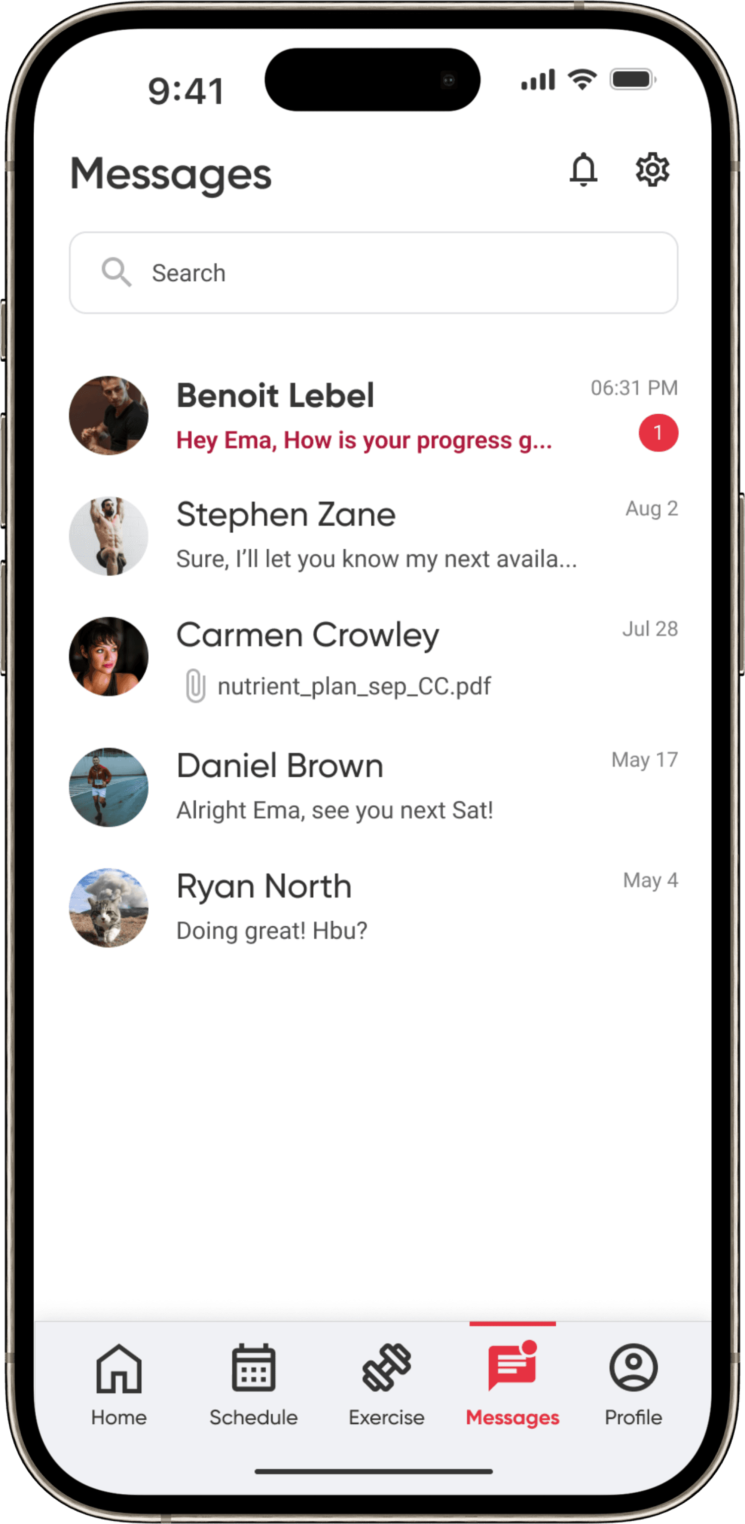 After
AfterProfile
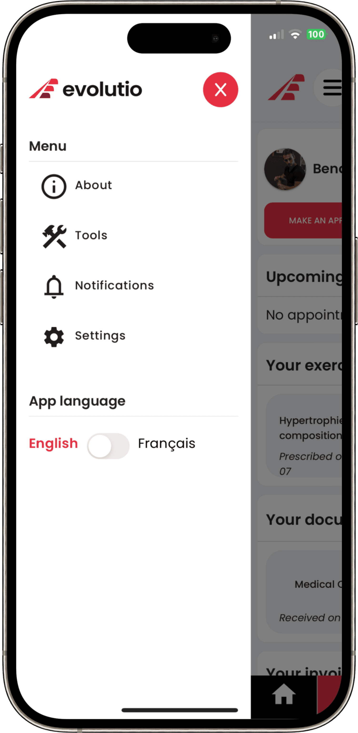 Before
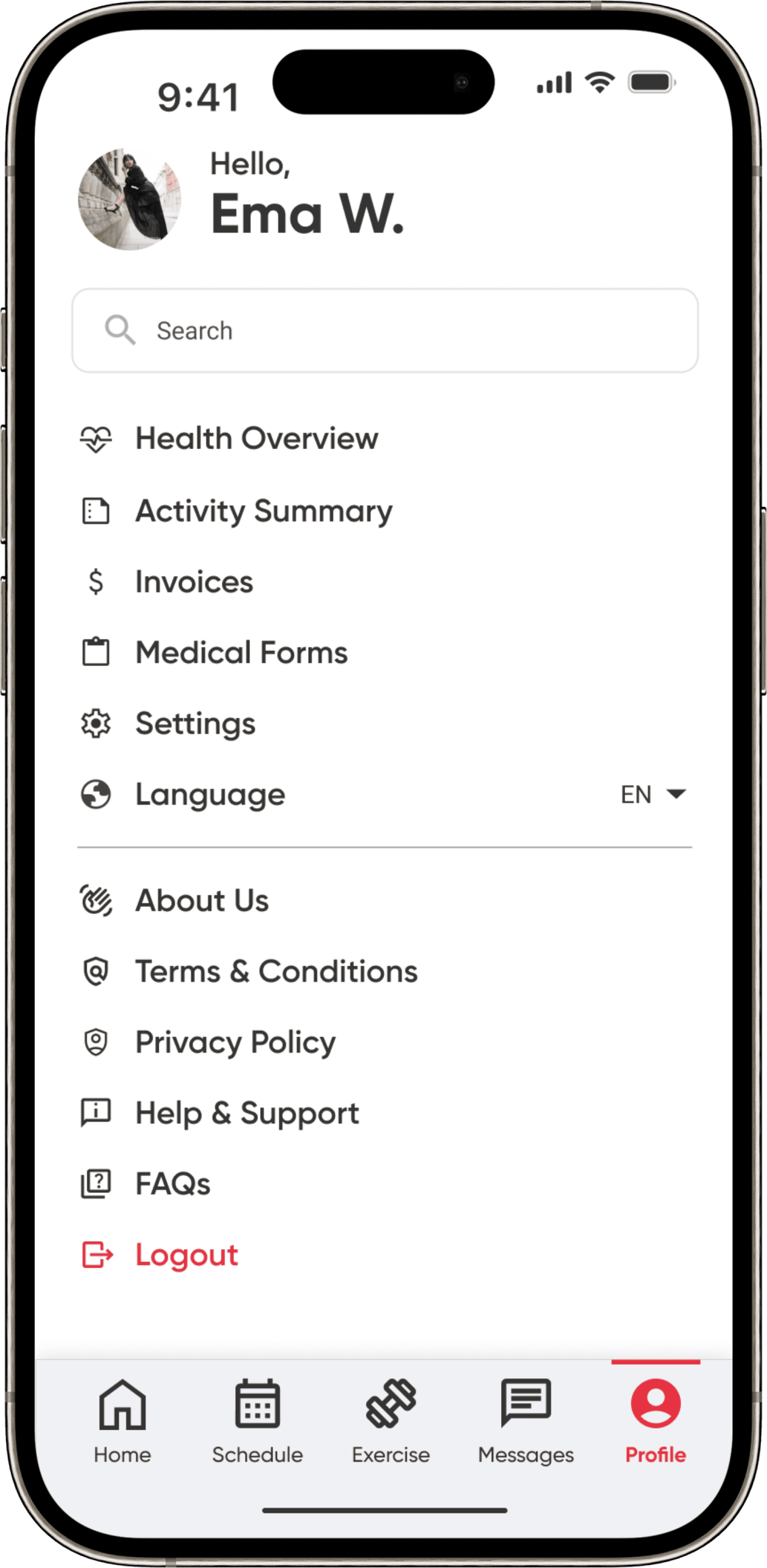 After
AfterInvoices
 Before
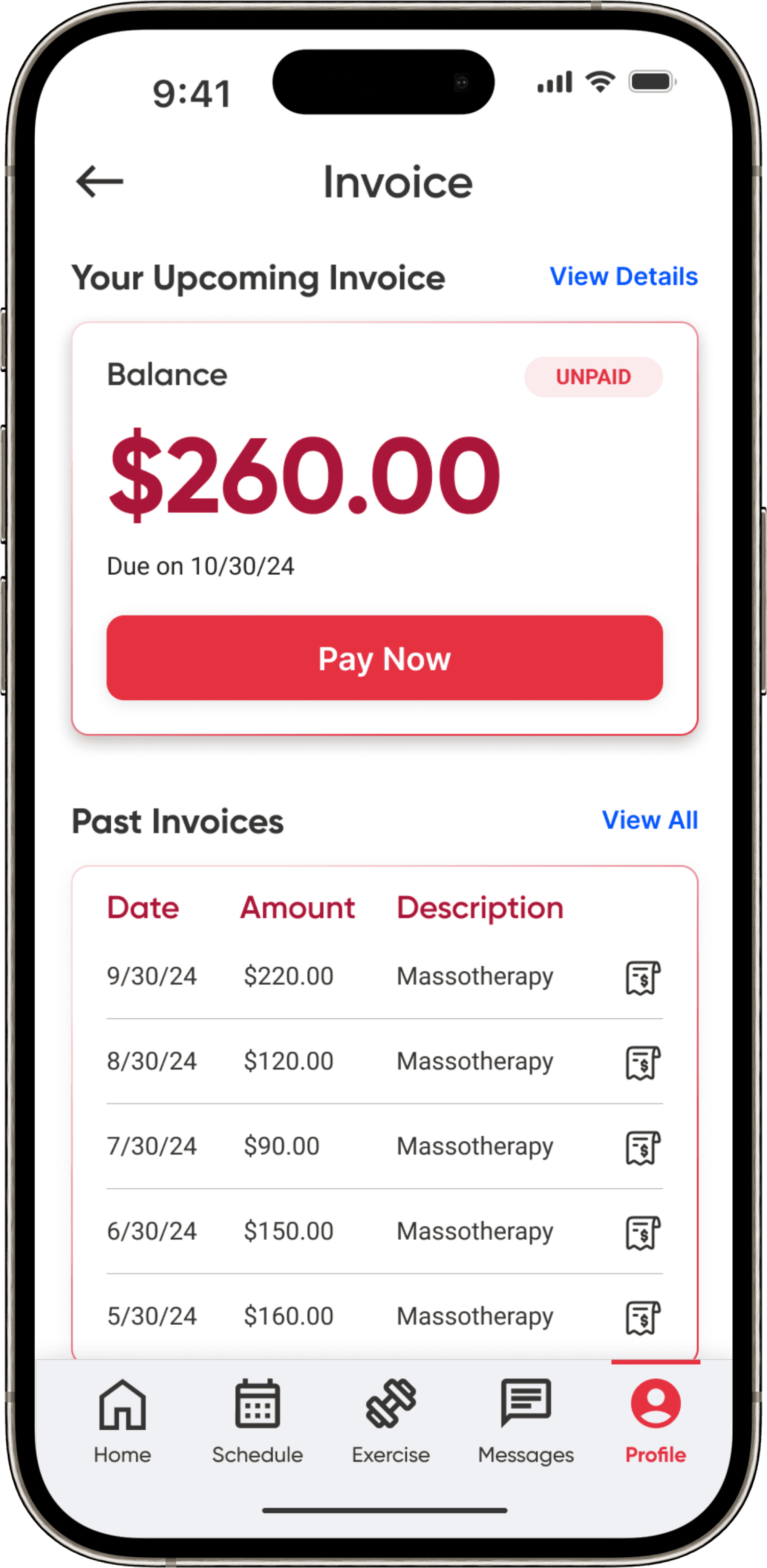 After
AfterMedical form
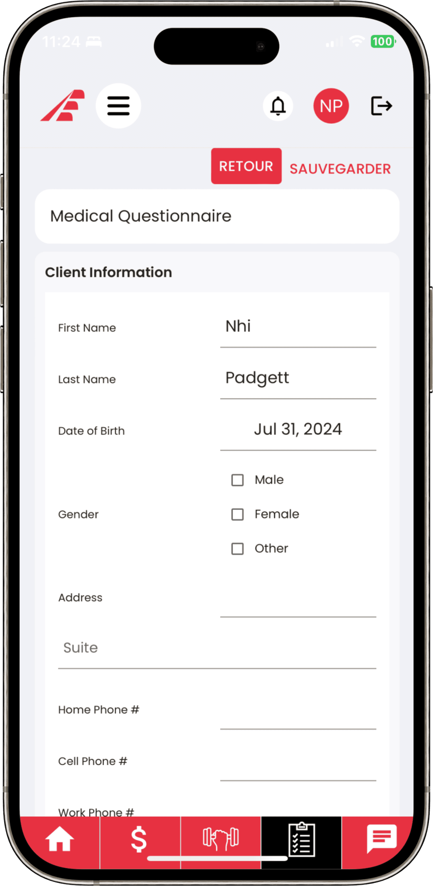 Before
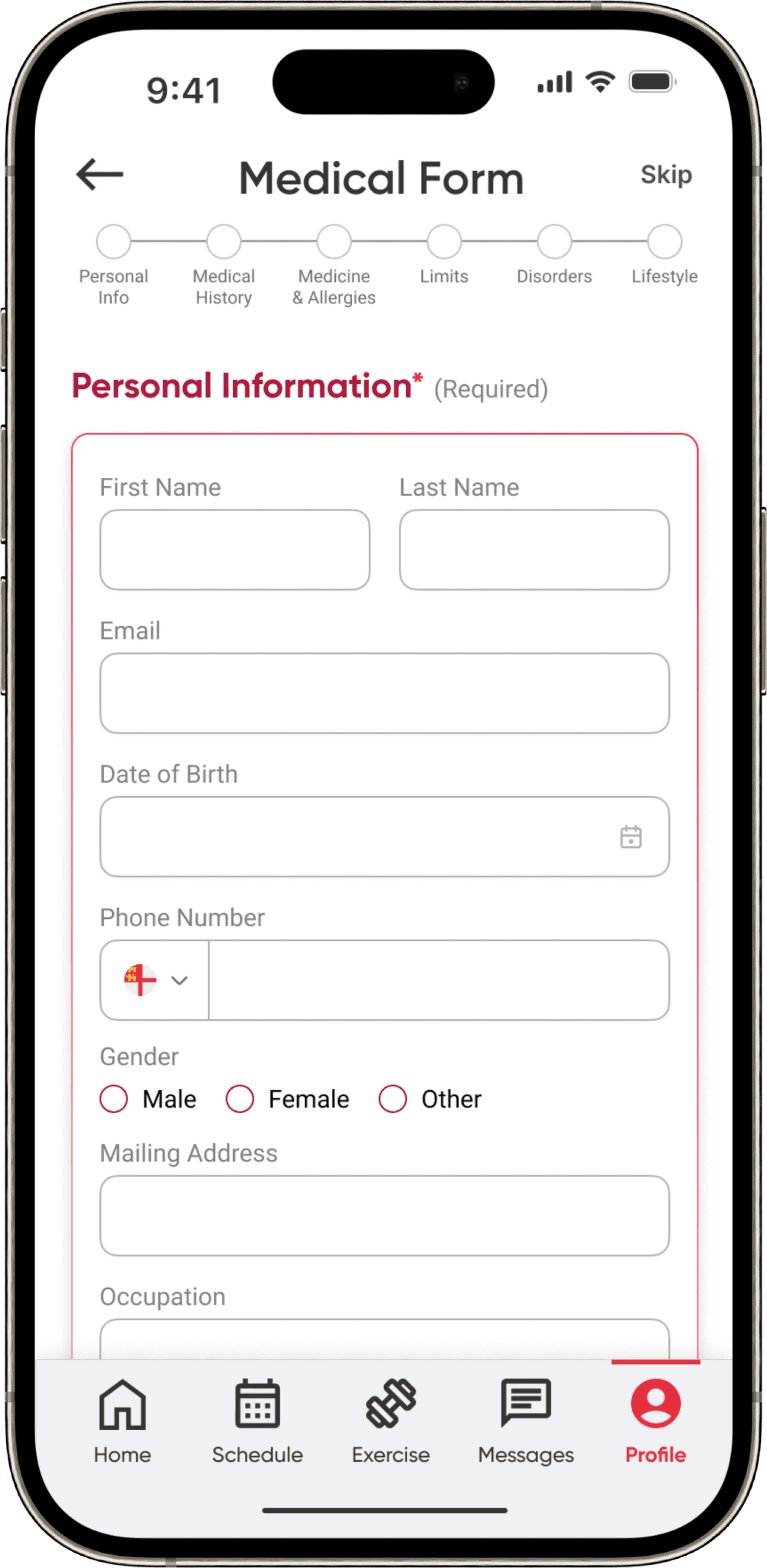 After
AfterValidation
Two rounds of testing, measurable results
Lo-fi testing with 4 users caught two issues early: 56% preferred picking date & time on a single page, and 70% struggled with the exercise instruction flow. After iterating, hi-fi testing measured task success across the MVPs: 96% scheduled an appointment, 96% messaged their therapist with attachments, 83% accessed documents, and 79% completed exercise programs.
The product
Introducing the redesigned Evolutio
Reflection
What I took away
Starting from a product without a design system was a constraint that became a freedom — it let us venture on different design approaches while staying anchored to MVPs that balanced user needs against a limited budget. Weekly iteration with the product owner meant no surprises at shipping time.
“Great team! Dedicated and hardworking. I am really satisfied with the work and results.”— Benoit Lebel, Evolutio President — Sep 2024