Smartales
An AI-driven e-book platform that helps parents spend less time finding the right books to read to their kids — designed end-to-end in a 7-day Google Ventures-style sprint.
The challenge
Seven days to design an AI reading companion
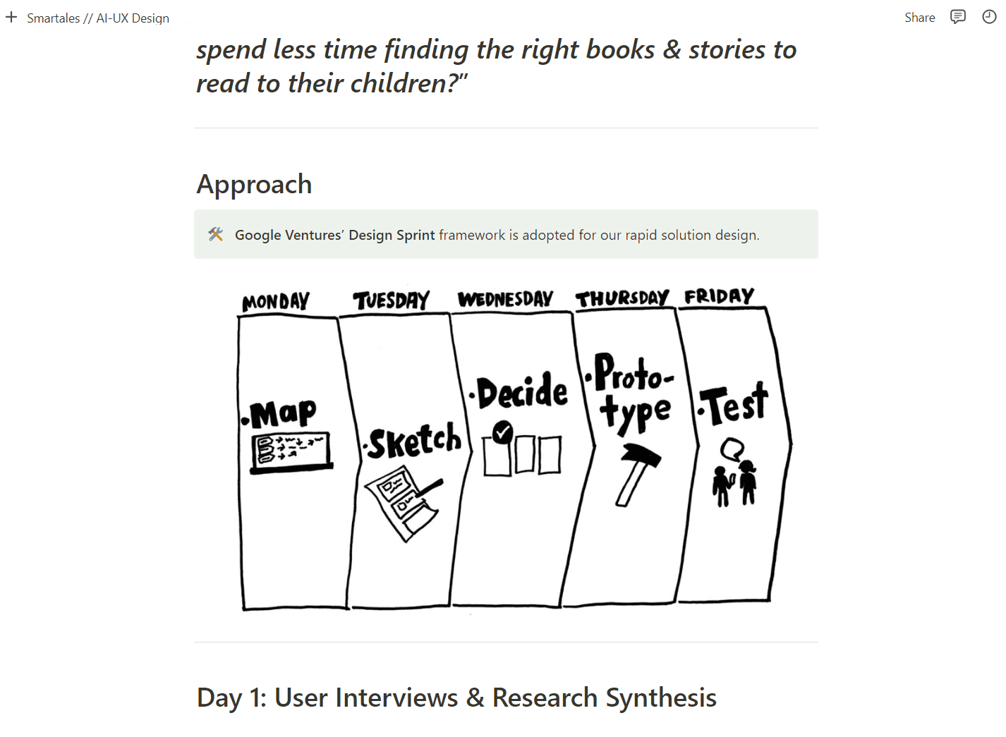
Parents of kids aged 4–9 find choosing books time-consuming: libraries are vast, content has to suit two comprehension levels at once, and judging whether a book is appropriate often means reading it yourself first. With a 7-day deadline, we adapted Google Ventures' Design Sprint framework and ran the whole process from a shared Notion plan I set up on Day 0 — every phase, task split, and note lived there.
- Day 1–2Discover & understand
Recruited and ran 6 moderated parent interviews; synthesized themes into a persona and four How-Might-We statements.
- Day 3Make a map
Mapped the critical user journey to the MVP; lightning demos of Blinkist, Kindle, and Bookly.
- Day 4Sketch
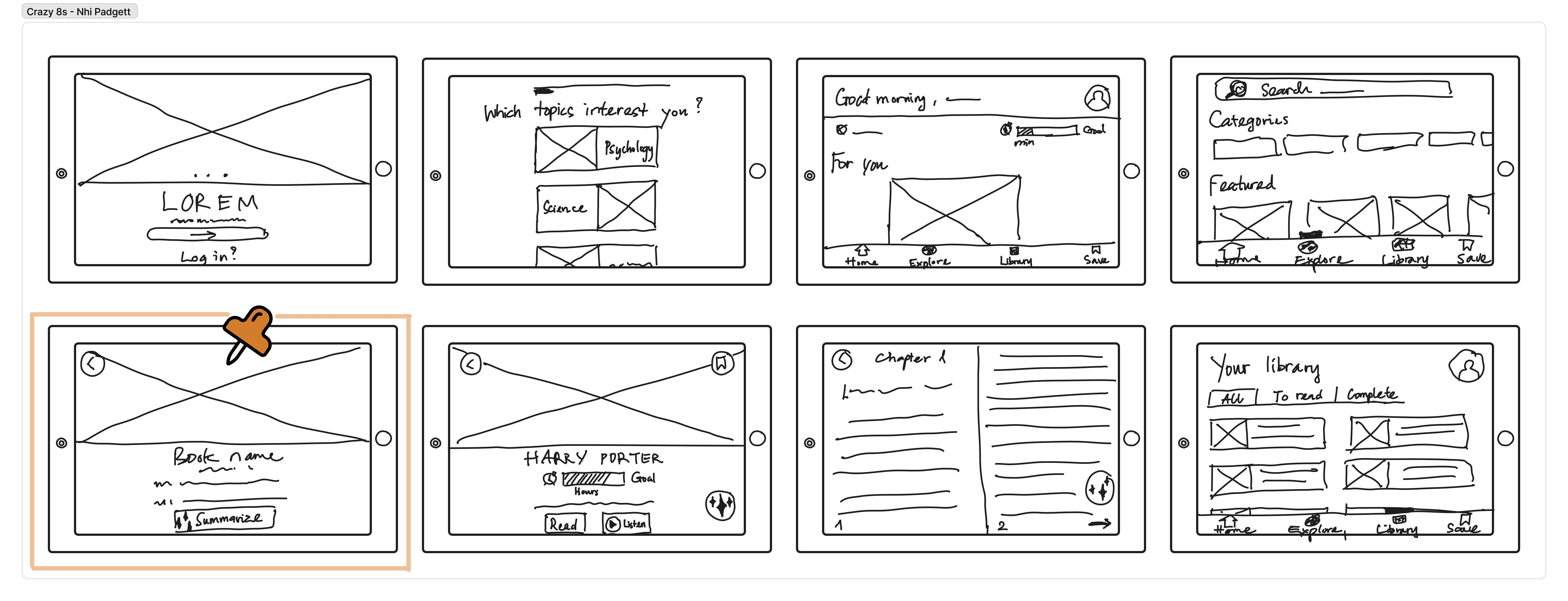
Crazy 8s — 16 ideas in 8 minutes — and locked the design constraint: iPad as primary device.
- Day 5Decide
Critiqued every sketch, bet on the generative-AI solution, storyboarded the critical flow.
- Day 6Prototype
Hi-fi prototype plus a full visual identity and design system.
- Day 7Test
5 moderated usability tests with the same parents from Day 1.
Days 1–3
Six interviews, one persona, four HMWs
I recruited and ran 6 moderated remote interviews with parents who regularly read to their kids. Synthesis produced our persona — Fiona, 34, a consultant reading bedtime stories to a 6- and a 4-year-old — and four How-Might-We statements about comprehension levels, personalization, content assessment time, and keeping discovery feeling like family time rather than a chore.
“I might know the children's books better than my kids — I usually need to read the whole story to evaluate it before reading it to them.”— Parent interview, Day 1
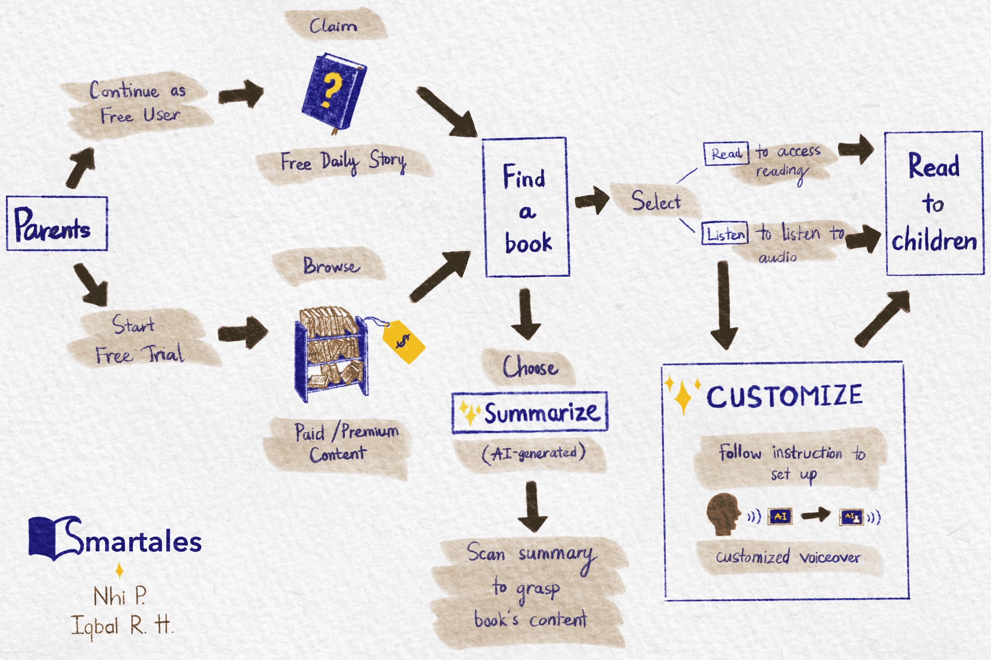
Lightning demos of Blinkist, Kindle, and Bookly benchmarked how leading readers handle summaries, syncing, and AI assistants — and where they overwhelm non-technical users. The journey map below turned all of it into one artifact: the critical route from finding a book to reading it together, with every AI touchpoint marked.
Days 4–5
Sixteen sketches, one bet

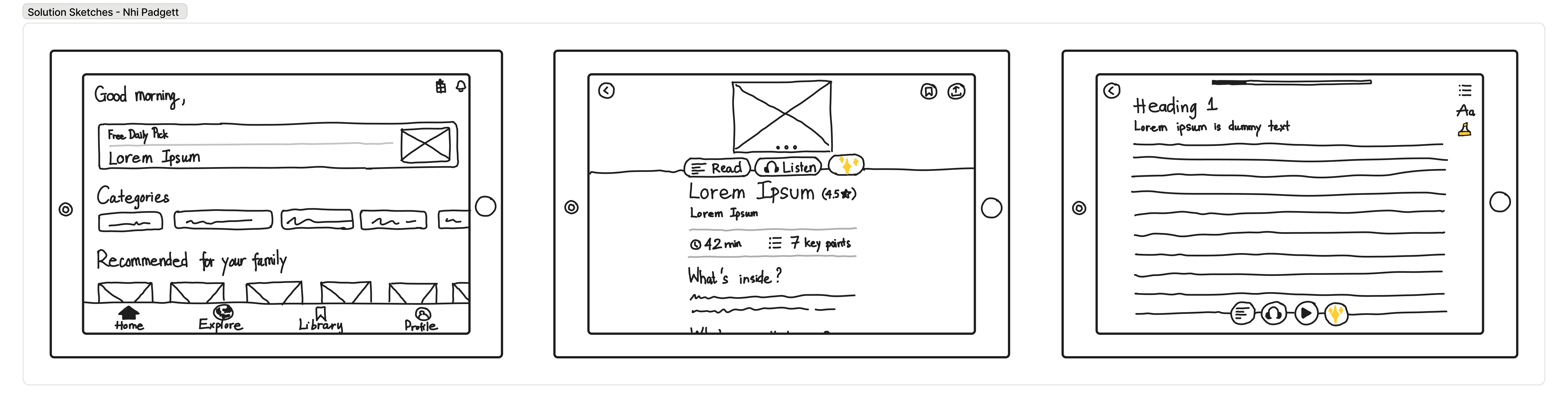
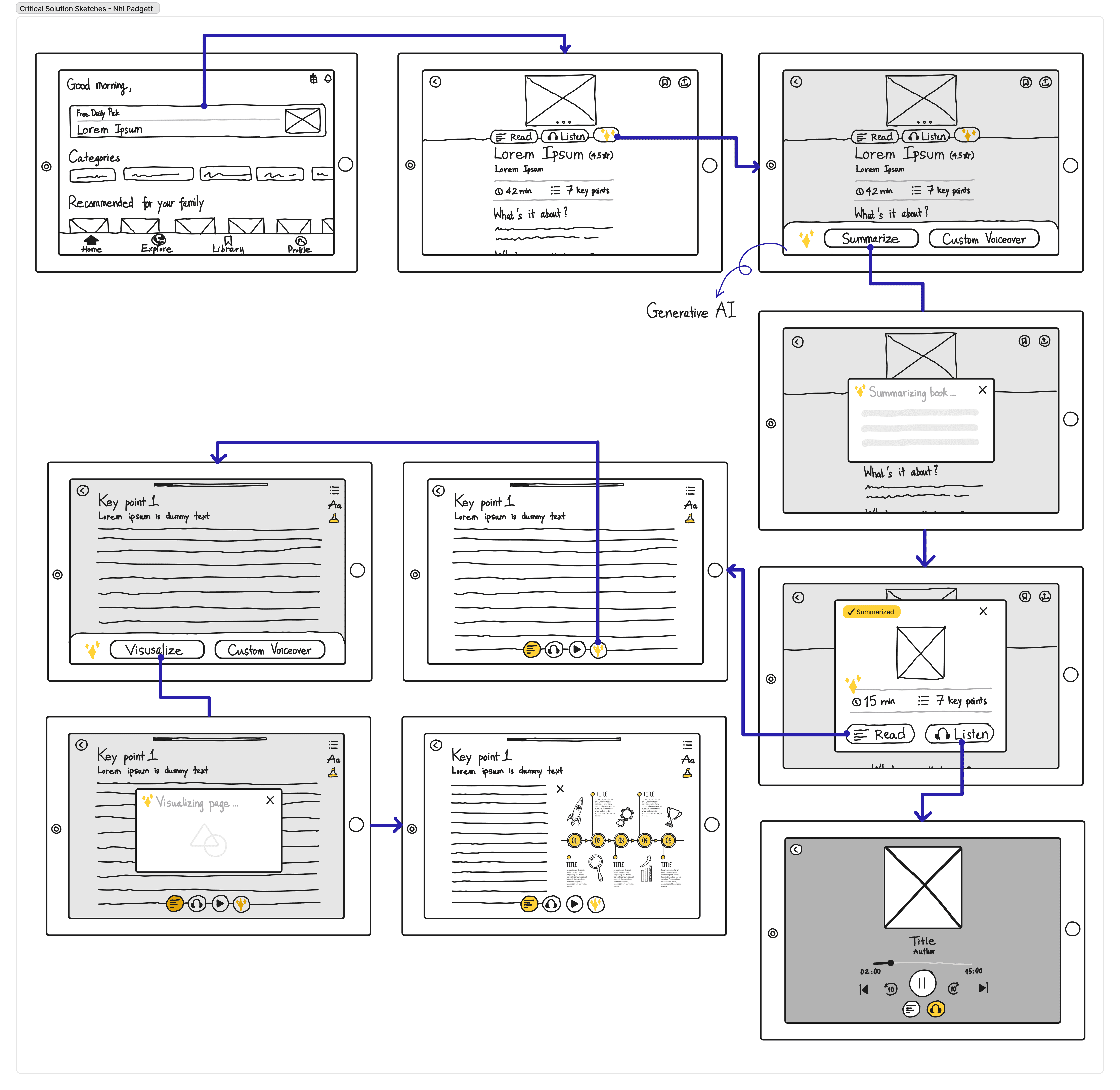
The winning direction became three AI features, each mapped to a specific pain point: Summarize (assess a book's content in seconds), Audio Customize (personalized read-aloud voices), and Visualize (AI-generated imagery to aid comprehension). We storyboarded the critical flow before touching a single pixel.
Day 6
Hi-fi prototype & visual identity
One day for the build: a hi-fi prototype of the three AI features, plus the visual identity to carry them — logo, Metropolis type scale, a navy/lavender palette specified for both light and dark modes with accessibility checks, and a component set covering button states and navigation icons.
Day 7
Testing the AI features
Five moderated usability tests with the same parents from Day 1. Common navigation was error-free — but the AI features exposed exactly the naming and trust problems that are cheap to fix now and expensive to discover after launch:
✗ “Summarize” read as a static book description, not an AI assessment tool — 3 of 5 participants
✗ Skepticism about how faithful AI-generated content is to the original book — 3 of 5 participants
✗ “Audio Customize” mistaken for technical controls like volume — 2 of 5 participants
Reflection
What a sprint teaches you
The sprint forced risk-taking beyond familiar design-thinking comfort zones. Early testing gave us honest signals about which AI applications feel feasible and trustworthy to parents — the naming issues are precisely the kind of insight rapid validation exists to catch. Next: recommendations that serve different comprehension levels within one family.